

Official Summary: (via Amazon)
When a mysterious package is delivered to Robin Ellacott, she is horrified to discover that it contains a woman’s severed leg.
Her boss, private detective Cormoran Strike, is less surprised but no less alarmed. There are four people from his past who he thinks could be responsible – and Strike knows that any one of them is capable of sustained and unspeakable brutality.
With the police focusing on the one suspect Strike is increasingly sure is not the perpetrator, he and Robin take matters into their own hands, and delve into the dark and twisted worlds of the other three men. But as more horrendous acts occur, time is running out for the two of them…
Career of Evil is the third in the highly acclaimed series featuring private detective Cormoran Strike and his assistant Robin Ellacott. A fiendishly clever mystery with unexpected twists around every corner, it is also a gripping story of a man and a woman at a crossroads in their personal and professional lives.
There's a cover, a release date, and a promotional blurb now... although I'm not quite sure if I'm sold an any of the promotional stuff. It's probably a good thing that I've been looking forward to this new Cormoran Strike release ever since the second book in this series.
The blurb feels a little lackluster; but I've been wrong before. I didn't care for the first Cormoran Strike book, but went on to read the second one anyway, because: J.K. ROWLING! And I ended up loving The Silkworm.
As for the cover illustration, while the colors are a good mix and the cover actually DOES look a lot prettier than the cover for The Silkworm, I can't help but feel like it's exactly the same as the the cover for The Silkworm, even though it's clearly not. They both still look very nice; eye-catching enough to draw my attention. Either way, I like both better than The Cuckoo's Calling, that's for sure; but that's just me.
But I dunno. I'm no expert on pretty covers. Maybe I'm just being picky. Let's see them side-by-side:

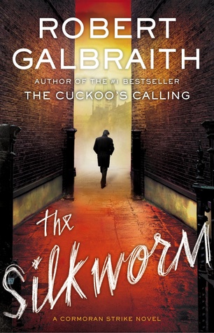

And here's a set of different variations of the cover illustrations with more blocky font, which I suppose has to do with different publisher, different format, or something. But I prefer this variation of The Cuckoo's Calling more... probably because It's more in sync with the other two covers. Above... it just feels out of place.


Okay, yeah. I'm weird. Because maybe I just really wanted an excuse to splash cover art all over a random post that I'm using to fangirl about how I'm very much looking forward to the next Cormoran Strike book. Because I really am.
October 1 for the Kindle edition. October 20 for hardcover.
 7
7
 7
7


